
How Upstatement Lets Strategy Drive Data Visualization
Hint: It’s not really about charts.
Data visualization has never been more ubiquitous. You see it in the health rings on your phone, the sparklines in your stock app, and even the bar chart embedded in your parent-teacher fundraising emails.
As tools for creating data visualization become more accessible, it’s even more important to focus on what happens before the graphic is built. Defining the audience. Aligning with strategic goals. Choosing compelling data. Telling a good story. These are all things we’re uniquely suited to do as designers — and all things that Upstatement does for its clients, which include advocacy groups, journalists, and research institutes.
Here’s a behind-the-scenes look at how we built strategy-driven data visualizations for PBS NewsHour, Everytown for Gun Safety, and McKinsey Global Institute.
PBS NewsHour Election Graphics:
Everywhere All at Once
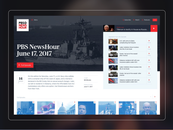
Our first project with PBS NewsHour elevated its online brand through a new website that serves video and articles equally well. When they asked us back to develop a suite of election results graphics, we zeroed in on a few key parameters:
The core of NewsHour’s brand is rigorous, un-sensationalized reporting. Their team punches above its weight — particularly on election nights — and competes with the big networks on measures like audience trust and non-partisanship.
They’d outgrown the off-the-shelf election widgets that come bundled with a subscription to the Associated Press.
While the digital, social, and broadcast teams have different workflows, there was a desire to centralize election graphics under a single system.
These insights helped to shape our deliverable: a suite of custom graphics, populated in real time by data feeds, that can be deployed across channels quickly and reliably. No copy-paste errors, no mismatched candidate photos. NewsHour editors now access a dashboard where they can generate broadcast graphics, download perfectly-sized images for social, and copy small code snippets to use on the website. And all of it is NewsHour branded.

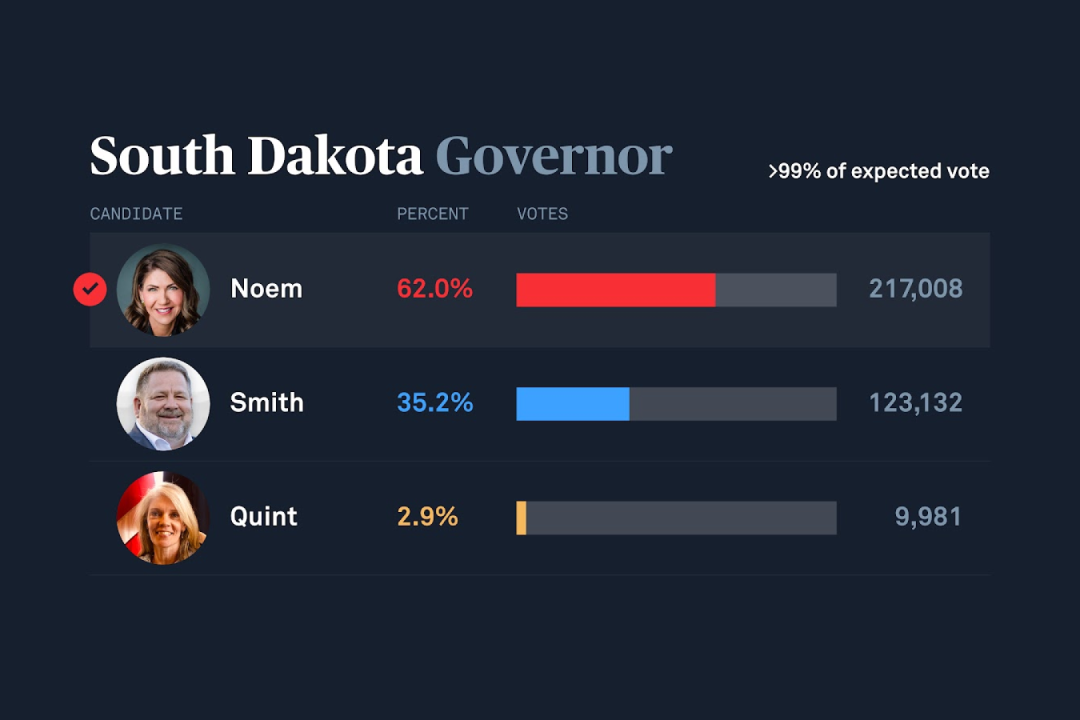
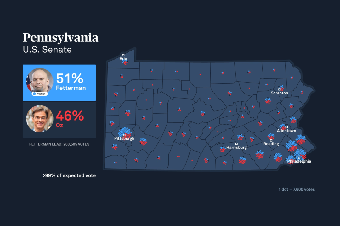
The graphics are simple and bold, equally legible on TV or in an Instagram feed. Perhaps the most notable design choice we made was in our state results maps: We saw an opportunity to diverge from traditional election choropleth maps which exaggerate the importance of larger counties by coloring them red or blue (because land doesn’t vote!). Instead, we overlaid dot clusters based on relative population; viewers can see the difference between a rural county going red or blue versus an urban one.
The system has now been battle-tested across multiple primaries, mid-terms, and general elections, upgrading the NewsHour’s workflow and extending its reach across channels. We think honoring these aspects of NewsHour’s core values — clarity, reliability, and nonpartisanship — expresses its identity just as much as the visual design does.
Everytown Gun Law Rankings:
Juxtaposing Cause and Effect
This thinking powers our work for advocacy groups as well. When Everytown for Gun Safety’s research arm developed a rubric for assessing gun law strength, we were asked to help visualize it.
Everytown’s legal team conducted a survey of key law types across all 50 states, then distilled those findings into a composite 0-100 “score.” The concept felt powerful in its own right: we could see the value of comparing one state to another and understanding which kinds of laws were and weren’t widely adopted. But while sketching out visualizations, we kept coming back to a big question: “So what?” Who says these kinds of laws are consequential? Would a skeptic take their importance on faith alone?
Some workshopping uncovered that Everytown was collecting related data: up-to-date, state-by-state gun violence rates. Once we prototyped what it would look like to bring these datasets together, we found a far more compelling entry point: Gun laws really do save lives, and we can show users the correlation.
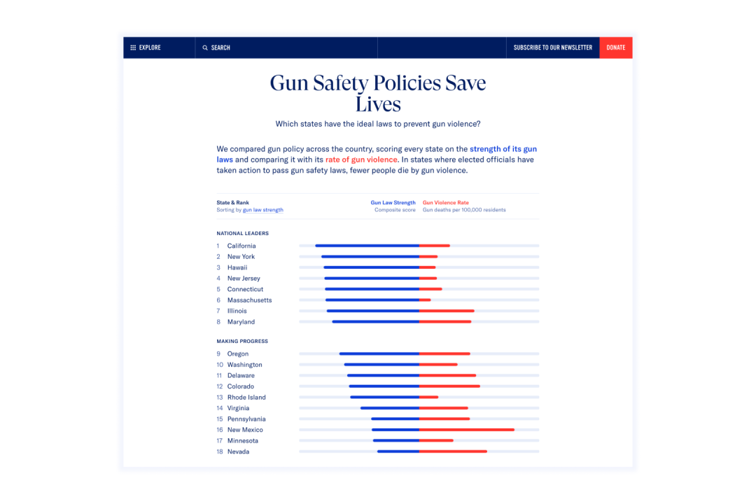
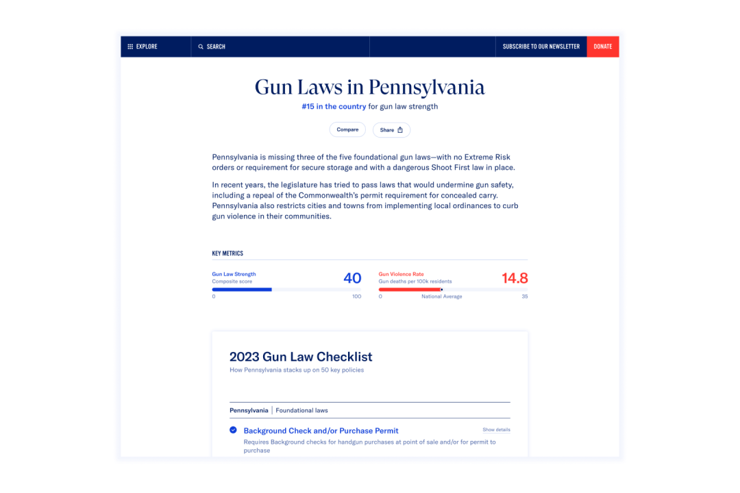
We went back to our sketches and redesigned the homepage to make this comparison the visual focus. Every time we show a state score, we juxtapose it with gun violence rates; this correlation is central to Everytown’s work. The state checklists of specific gun laws, the ability to compare states in a granular way, and the map views are all important parts of the experience. The laws-vs-violence opposition succeeded in driving media coverage soon after publication and even became an input for Fortune’s 50 Best Places to Live for Families.
McKinsey Global Institute:
Insights on Demand
Dataviz as a decision-making tool is a recurring theme. Most recently, we helped design and build a set visualizations of global trade flows for McKinsey Global Institute (MGI). This group conducts macroeconomic research to empower business and government leaders to identify trends and plan for the future. Objectivity is central; the research is independently produced and free to view.
The global trade flows datasets are massive, covering 25 years, 20 sectors, and dozens of countries. Correctly labeling a view of certain data often means invoking technical terms inherent to specific concepts (Quick, what does HHI measure?*).
We quickly discovered that the project had two goals in tension: providing users granular access to the many permutations of variables in the data (Textile exports from Vietnam to Canada in 2019), while showcasing the practical applicability of the visualizations (why this data is important and what you can use it for).
So, we set ourselves a challenge: For each chart we designed, could we write a headline in the form of a question that the visualization would then serve as the answer to? That is, could each visual do one and only one job while serving up many slices of data? This became our method for refining, editing, and iterating, especially when it came to deciding how much data to show at once, what supporting information should appear in a tooltip, etc.
We also insisted on user-testing the charts throughout the build, to gut-check our direction early on and dial in the finer points towards the end. We found the headlines-as-questions approach validated repeatedly. Even savvy users accustomed to complex interfaces understood what the visualizations were and weren’t designed to show thanks to this framing.
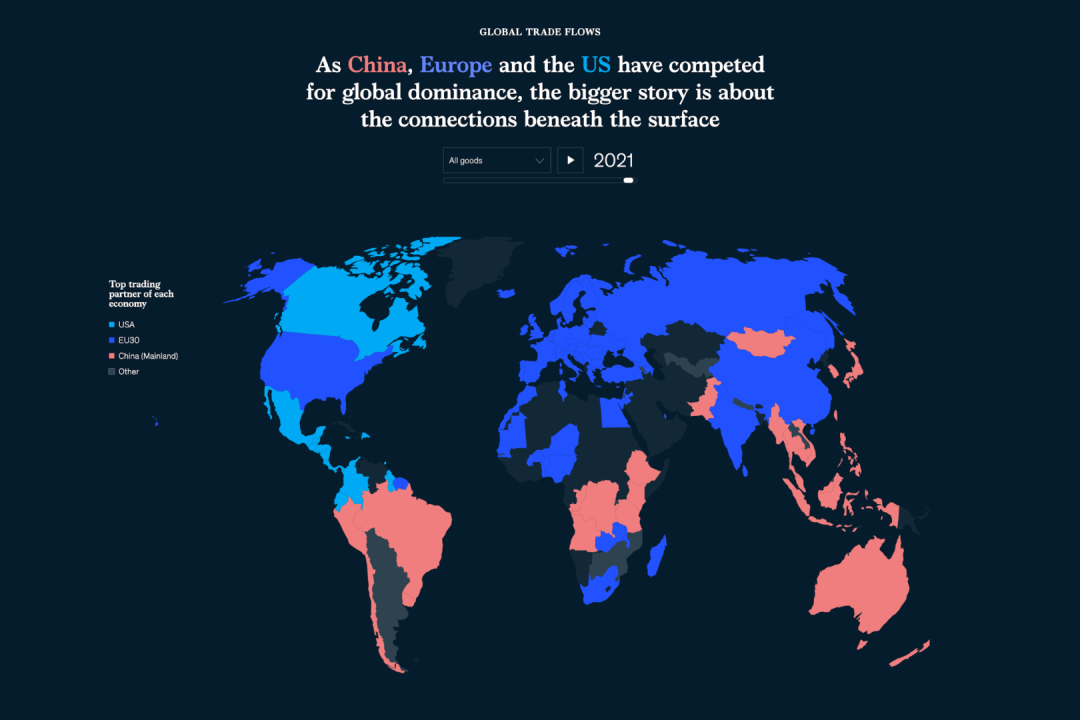
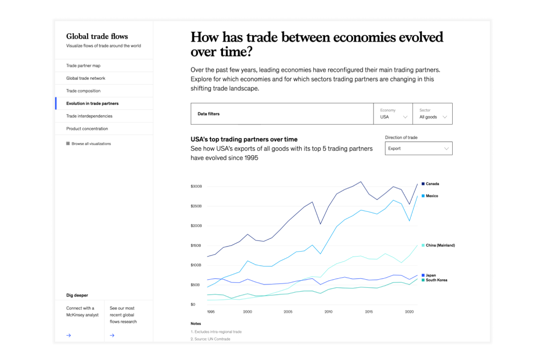
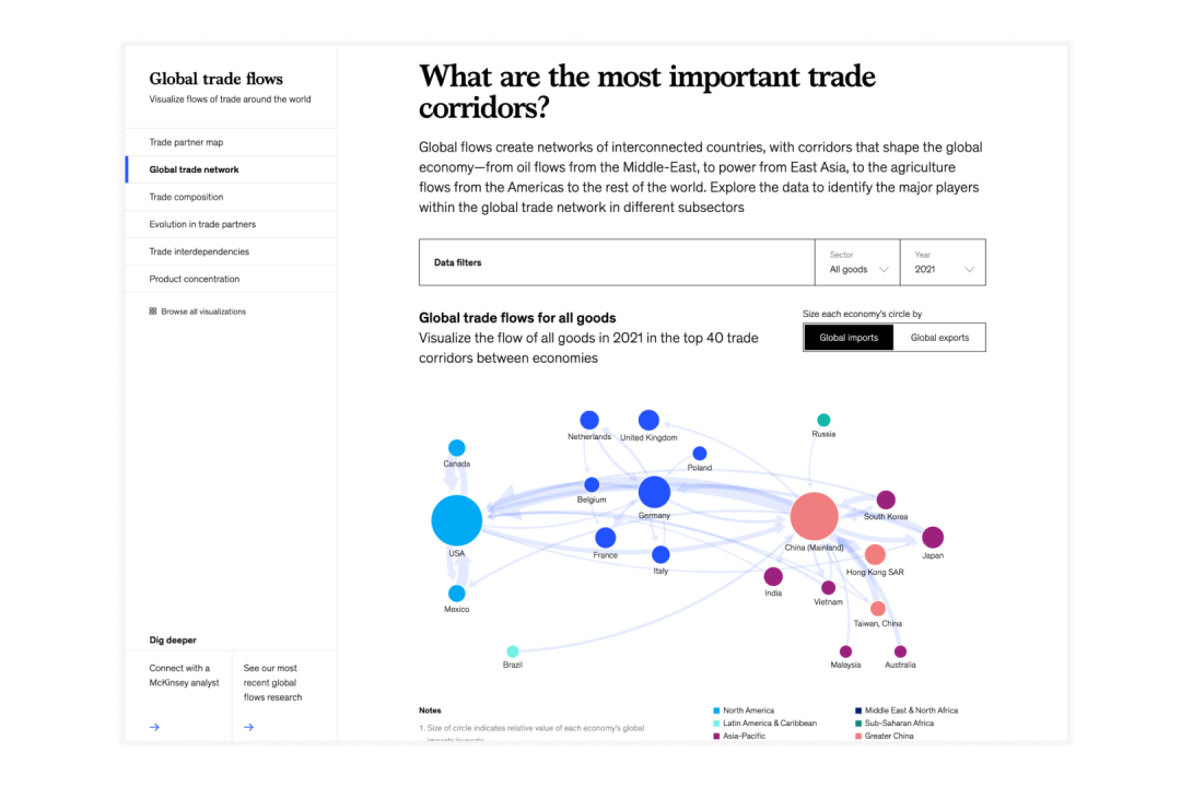
Alongside these headlines, we included “smart defaults” inside the charts: Visit the homepage and you get a high-level story about leading trade partners. Visit the trade interdependencies page and we default to a (timely) comparison of the USA and China. From there, the user can manipulate the controls to address their specific interests but always in the context of the larger questions being framed by MGI.
Unlike other kinds of digital publishing, data visualization work promises the user a particular kind of credibility, objectivity, or precision. It’s incumbent on designers and developers to deliver on that promise. Our work has shown us that there’s also a bigger context to consider: the client’s strategy for sharing the data in the first place. Data design needs this editorial layer to fully meet our clients’ goals. And the more the design and functionality of our work reflect their larger objectives, the more impact they can truly have.
Thanks to Tito Bottitta, Britt Dalton, and Molly Butterfoss.
James Muspratt is a designer at the digital product studio Upstatement.
*The Herfindahl-Hirschman Index (HHI) measures market concentration.